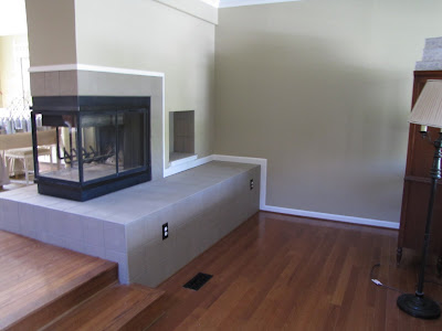
to this? (Check it out here)

Ever since then I've wanted to have a mantle wrapping all the way around so that I would have one rectangular space above the mantle instead of that difficult upside down L shape wall space to fill.
Enter Dad.
First he removed the trim from the top side of the fireplace surround. Then he screwed strips of wood into the wall just above the tile to support everything. Then he added the little silver brackets to support the mantel shelf. Next the shelf boards were added on top- they are screwed into the wooden strips and the brackets. He even inserted little wooden pegs where the shelf boards meet at the corners to make sure they would stay even. Then he trimmed the face of the shelf boards in a narrow decorative molding.


Then it was time to add the decorative moldings. First he attached baseboard molding upside-down to the underside of the mantle shelf in order to give the crown molding something to attach to. The baseboard molding is screwed in from the top of the mantel shelf.

Next he trimmed it all out in crown molding.
Some action shots:

Can't you just hear him grunting?!

Wanna know something really funny? Whenever my dad works on a project he makes up his own expletives. When I was a kid I thought he was cursing in Italian because he's Italian and that's kinda what it sounds like. But, nope. Turns out it's just his own language. Now everyone in my family jokes that Dad speaks Swahili when he's working.

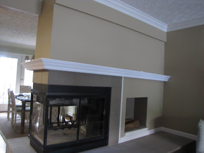
After spackle, caulk, sanding and two coats of paint, it now looks like this!

and it is super sturdy! I could seriously do chin-ups on it! Okay, someone who can do a chin-up could do chin-ups on it!
Now I just have to figure out what in the world to put up there! (Pay no attention to the vase of pinecones and candlesticks on the dining room side- I was just experimenting...)

Thanks so much, Dad! I absolutely love it! You rock!!
BTW- this dining room side is going to be a little difficult to accessorize because of the indentation above the fireplace. I prefer symmetry, but I may be forced into another arrangement on this side because of the indentation. I may start by trying to force some symmetry by leaning something (wreath, mirror...) against the center line, hopefully masking the indentation, but I'm not sure that will work. Oh, and I'll have to remove my script "F" in order to do that, but I believe it is repositionable and I can think of lots of other places in my house to use it, maybe over the mantel on the living room side in the center. What do you think? Suggestions?
Love,


This turned out great, Pam! I was impressed with your spray paint job to begin with, but the mantel really finishes it off nicely. Thank God for handy dads, huh? :-) I wonder what it would look like to treat that entire area as a gallery wall (including the space of above the fireplace)? Or keep the above the fireplace area similar to what you have it and treat the entire side to the left as a gallery wall?
ReplyDeleteCongratulations, Pam! I know you're so thankful for your Dad! Your mantel looks marvelous.
ReplyDeleteIf you have a large mirror or something that would hide the vertical indentation on the dining room side, you could certainly lean it against the wall and see if it hides the indentation. If that doesn't work, perhaps you could just decorate the part above the fireplace as a traditional mantel and use the space to the left as a wall to hold art. If you do have a large mirror, you could even try putting it all by itself on the left side of the mantel and then putting accessories in the indented space over the fireplace. You're going to have to fool around with it, but I know you'll come up with something.
You should get an award for "Best transformation"--to think that you started with pink tile and no mantel!!
Way to go dad...it looks awesome!
ReplyDeleteDoes your Dad work for others in need? What a wonderful job! I'd stop trying to fight the archetecture of the "indent" on the dining room side and why not paint that indentation with black chalk board paint and put up a "menu" since it is on the dining room side? Then place the decorations on the other side of the mantel...it will look great! I have a great photo for inspiration if you'd like to see one? You could even have your dad trim that area out as well. Hope this helps, fondly, Roberta
ReplyDeleterlphilbr13@aol.com
Wow! Your dad is awesome! It looks great - so much improved!
ReplyDeleteWow your mantel looks great! What a blessing to have a dad who can do such great work!
ReplyDeleteYour dad does rock. Lucky you. :) Now go give him another hug.
ReplyDeletePam
Nice work, Uncle Jim!
ReplyDeleteDads are awesome!
ReplyDeleteHere's what I would consider for the indented area: move the F elsewhere, then center a mirror or framed artwork in the indentation. Then accessorize the mantel under the indented portion like you would any mantel. To the left of the indent, using framed photos, lean some on the shelf (mantel) and hang some on the wall. Essentially thinking of it as two different spaces.
But I do like Roberta's chalkboard idea too!
What a great project - love how it all came togther
ReplyDeleteLove it and love you F as is! It's gorgeous!
ReplyDeletenice house here, ah.. great blog, great writing, incomparable artistry!
ReplyDeleteYour mantel looks fabulous. What a great job and such a wonderful idea. Love it. Hugs, Marty
ReplyDeleteThis is so freaking gorgeous I can't even take it. RIDICULOUS. Please come live with me and decorate my home. Please? Pretty Please? Gifted.
ReplyDeleteThis is FAB-U-LOUS! What an awesome dad you have, I can't believe how you changed that fireplace, I'm so impressed! Go you and Go dad!
ReplyDeleteCan you send dad over to my house next? :)
ReplyDeleteIt's beautiful!
I'm sure he is pleased to have been able to help you!
Good job, dad!
I don't think Dad is grunting, I think he's Lamaze breathing.
ReplyDelete-c